Overview
Toth Electric, a residential and commercial electric company, is a newer business established in 2017. Located in New Jersey, they are looking to market themselves locally through promotion of their brand and word of mouth. Toth Electric sought a classic look to represent their old-fashioned attitude towards great customer service for neighbors in their community. This logo is used on business cards, stationary, clothing, and company vehicles.
Solution
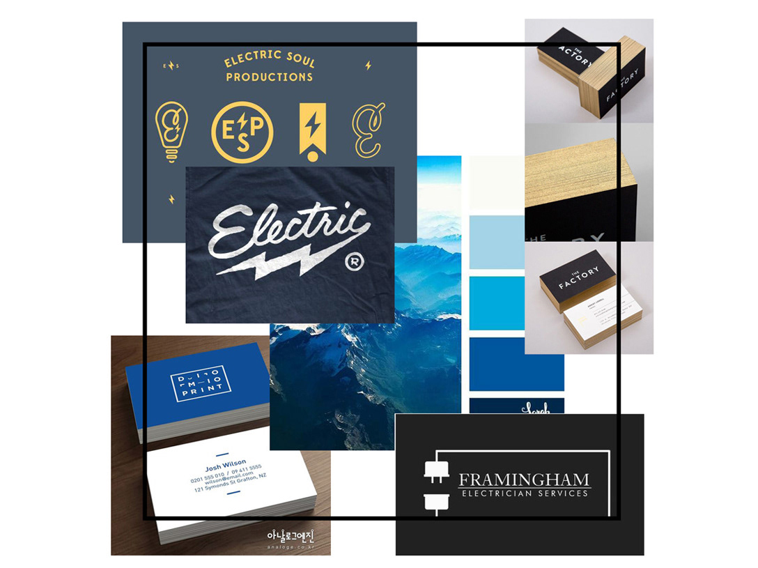
With the addition of a colored option in blue, the simplicity of the black and white logo provides a clean look. The color blue in the logo suggests trust, loyalty, wisdom, confidence, and intelligence. Combining a simple geometric shape with the addition of a classic lightning bolt gave this logo a modern, yet retro, feel. I chose the copperplate font because the glyphs are reminiscent of stone carving or lettering on copperplate engravings, which leaves a clean, crisp, masculine impression.
