Overview
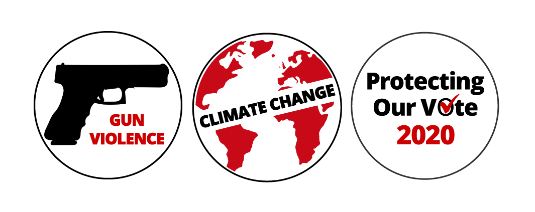
WhoWhatWhy is a nonprofit organization that focuses on exploring important issues by utilizing forensic journalism. Using strong images to capture the audience's attention, WhoWhatWhy can communicate a heavy message though graphics. WhoWhatWhy is featuring three new editorial sections: Gun Violence, Climate Change, and Protecting Our Vote 2020. I was tasked with designing a round icon that could be used as an identifying mark on all editorial projects featuring each of these subjects, including articles, emails, promotional images, panoramas, and site pages. While creating these graphics, I was challenged with developing concepts that would be clear, adaptable, and immediately recognizable in different sizes and in a variety of different applications. I was also asked to keep a unified feeling between the three icons to maintain consistency throughout the designs.
Solution
I chose to go in the direction of bold, minimal, text-heavy designs. The combination of recognizable, clear graphics provides a clear message to the audience regarding the goal of these images. These designs are also consistent with WhoWhatWhy's brand identity, color palette of red and black, and OpenSans font for the copy.
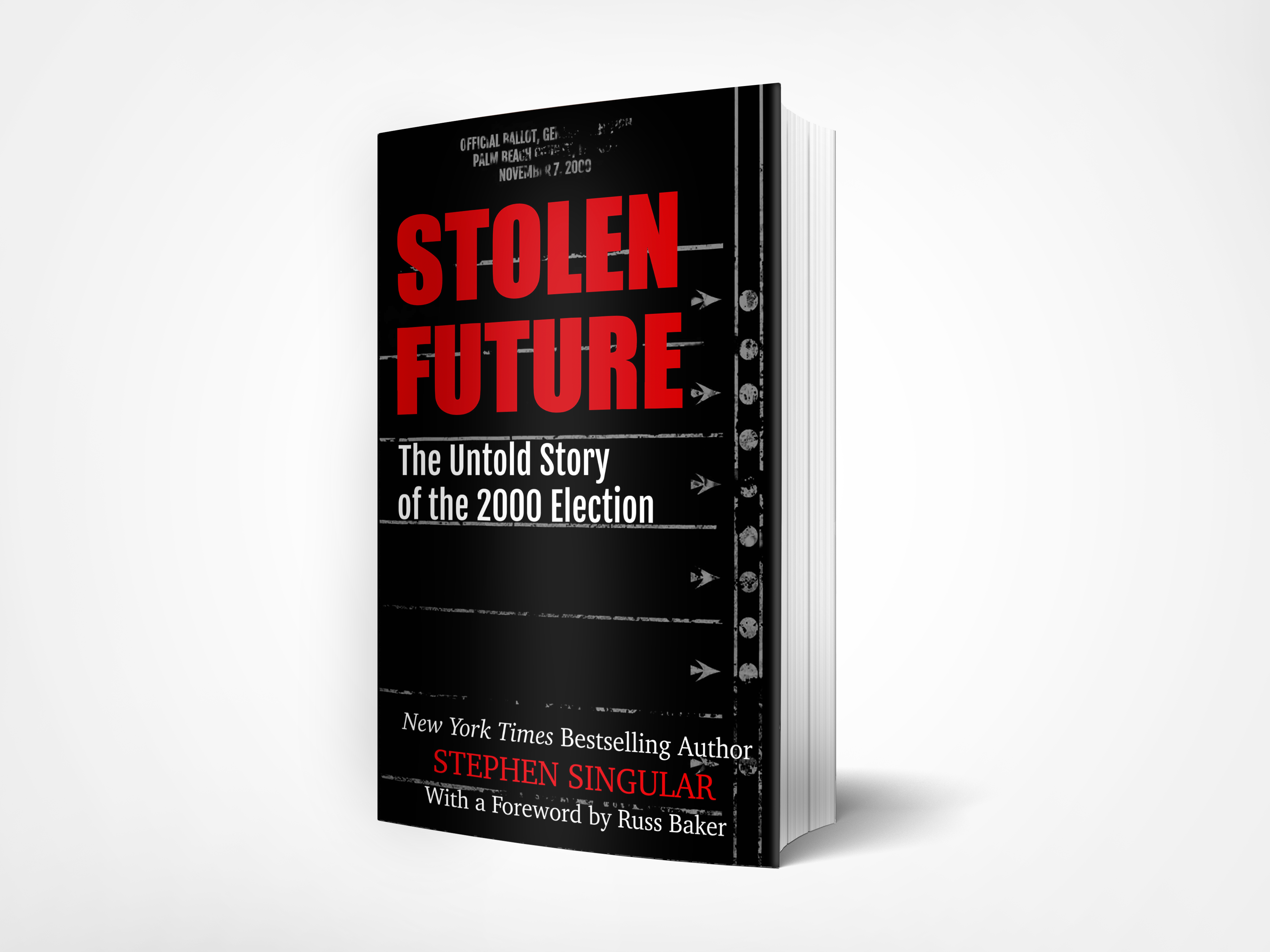
Final Design Application