Overview
Toth Electric, a residential and commercial electric company, is a newer business established in 2017. Located in New Jersey, they are looking to market themselves locally through promotion of their brand and word of mouth. Toth Electric sought a classic look to represent their old-fashioned attitude towards great customer service for neighbors in their community. This logo is used on business cards, stationary, clothing, and company vehicles.
Solution
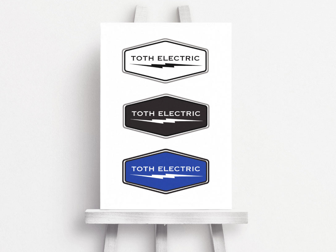
With the addition of a colored option in blue, the simplicity of the black and white logo provides a clean look. The color blue in the logo suggests trust, loyalty, wisdom, confidence, and intelligence. Combining a simple geometric shape with the addition of a classic lightning bolt gave this logo a modern, yet retro, feel. I chose the copperplate font because the glyphs are reminiscent of stone carving or lettering on copperplate engravings, which leaves a clean, crisp, masculine impression.
Workflow
Analysis > Research > Mock-up > Design > Submit for Approval > Refresh > Live
Mood board
I created this mood board to inspire the design of Toth Electrics logo. The simplicity of black and white provides a clean look with the addition of a colored option in blue. In choosing the color blue, the logo suggests trust, loyalty, wisdom, confidence, and intelligence. Combining a simple geometric shape with the addition of a classic lightning bolt gave this logo a modern, yet retro feel. I chose the font copperplate because the glyphs are reminiscent of stone carving or lettering on copperplate engravings, leaving a clean, crisp, masculine impression.
Logo
In the end, I created three color options of their logo to be used in a variety of different applications.
Business card design
Stationary Set
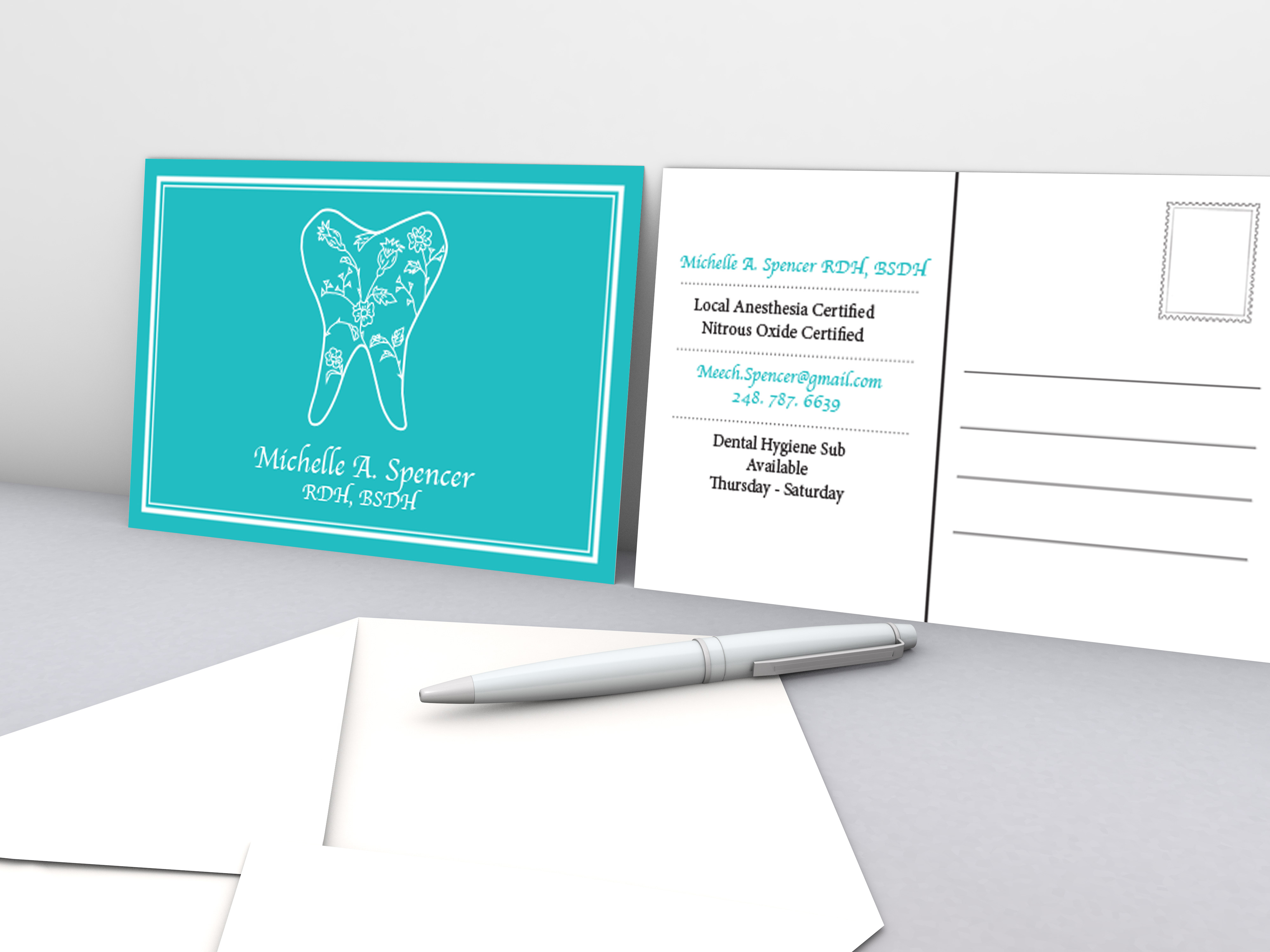
With the design of the stationary set, I wanted to offer Toth Electric a range of options to fulfill the needs of their company. Included is an invoice, letterhead, postcard, and a personalized notebook that could be used for taking notes on location or whenever the need arises.
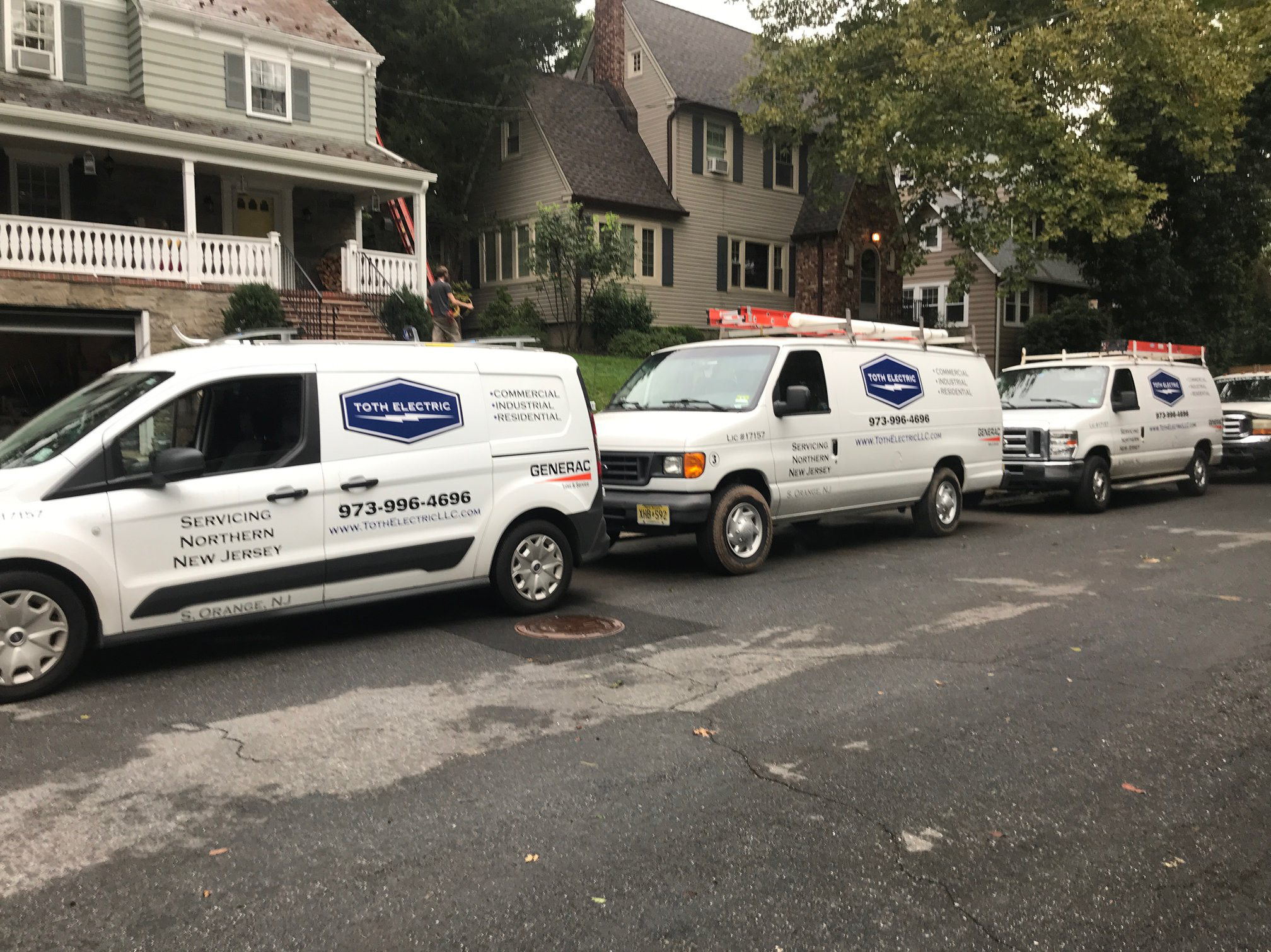
Van Wrap
The logo was used on the company vans.
Square Logo
I created this logo, featuring only the lightning bolt, as an alternative for when the need arose for a simple, small, square logo design. The addition of the color blue in the logo suggests trust, loyalty, wisdom, confidence, and intelligence. Combining a simple geometric shape with the addition of a classic lightning bolt gave this logo a modern, yet retro, feel.
