Overview
Rustic. Simple. Beautiful.
Beautiful Bear Design is a conceptualization of my personal brand. My goal was to create a logo that would communicate my love for hand-drawn illustration and also tell a personal story.
Solution
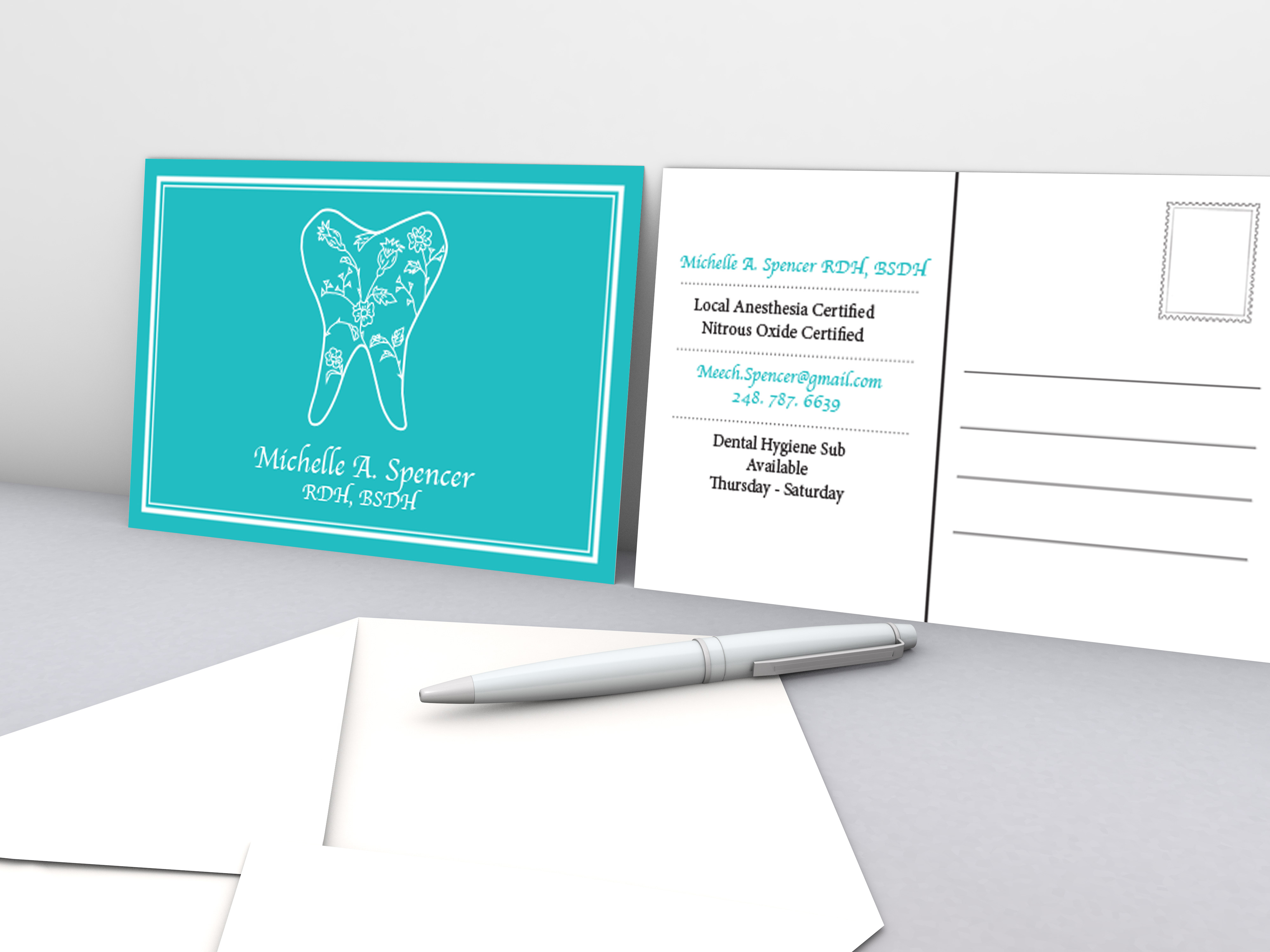
Inspired by my family's nickname for me growing up, the bear exemplified the strong, wild, and perfectly simple graphic I had been searching for. The loose, undone structure of the floral illustration creates an interesting contrast against the smooth, solid outline of the bear. This juxtaposition exemplifies my personal love for the contrast between strong and soft aesthetics. I used a playfully simple font (Ayuthaya) for the logotype that played well off of the loose illustrations of the flowers. In some instances, I also placed a double black rectangle around the logo design to create a more intimate feel. On the stationary, I used a placid teal tone. Teal combines the calming qualities of blue with the renewal properties of green. It is a revitalizing color that also represents open communication and clarity of thought.
Workflow
Analysis > Research > Mock-up > Design > Live
Mood Board
In this mood board, I was looking for ideas to inspire a soft, rustic, and floral design.
Preliminary Sketches
Stationary Set
Below, I have created a range of stationary items I could use within my business.
Business Cards
Decorative Card
