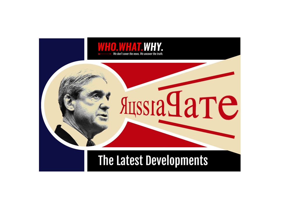
Overview
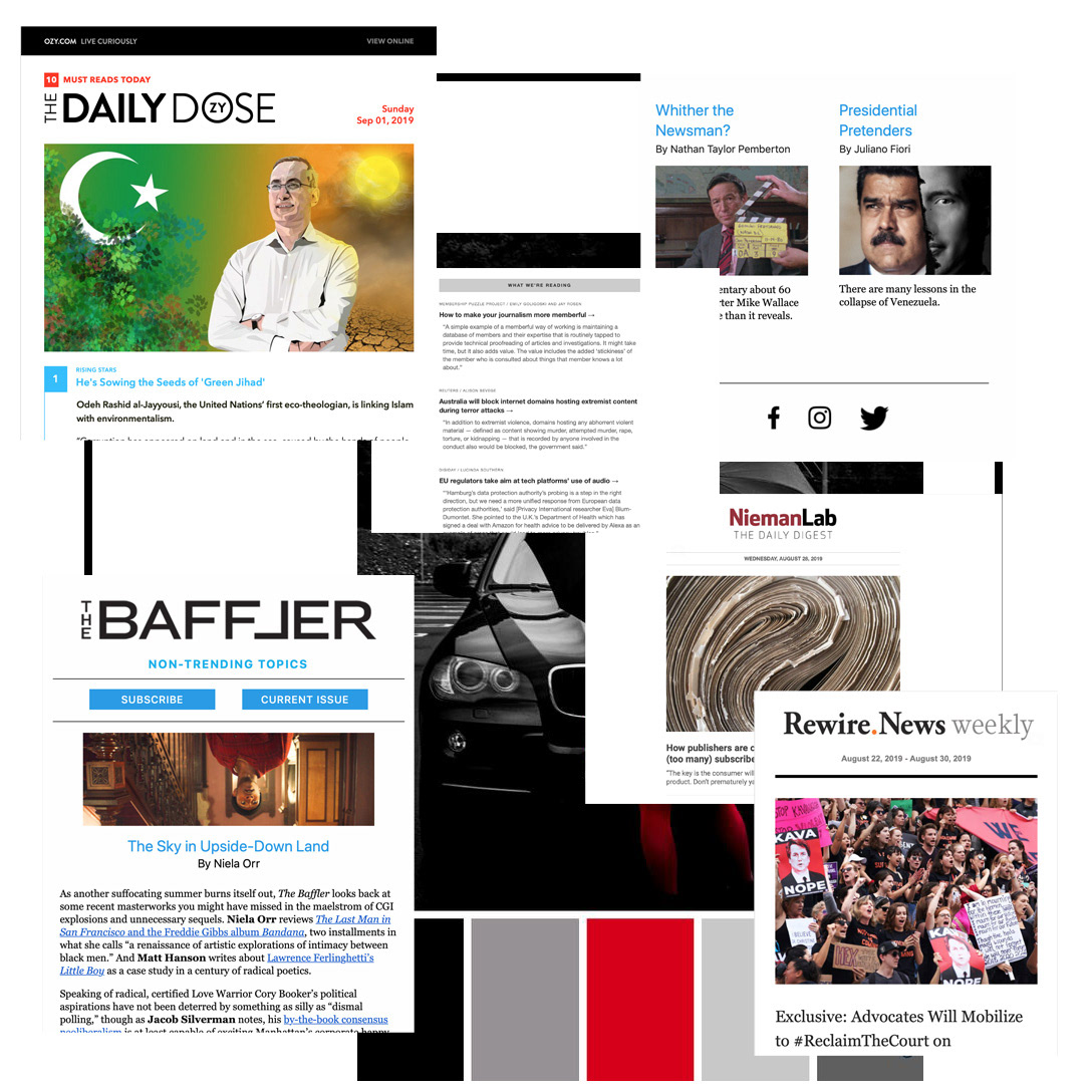
WhoWhatWhy is a nonprofit organization that focuses on exploring important issues by utilizing forensic journalism. Looking to refresh their daily newsletter, they sought a clean, minimal feel. I found inspiration in newsletters like "The Baffler" and "NiemanLab, Daily Digest." Increasing participation from the audience was a top priority and, therefore, UX was at the forefront of my design.
Solution
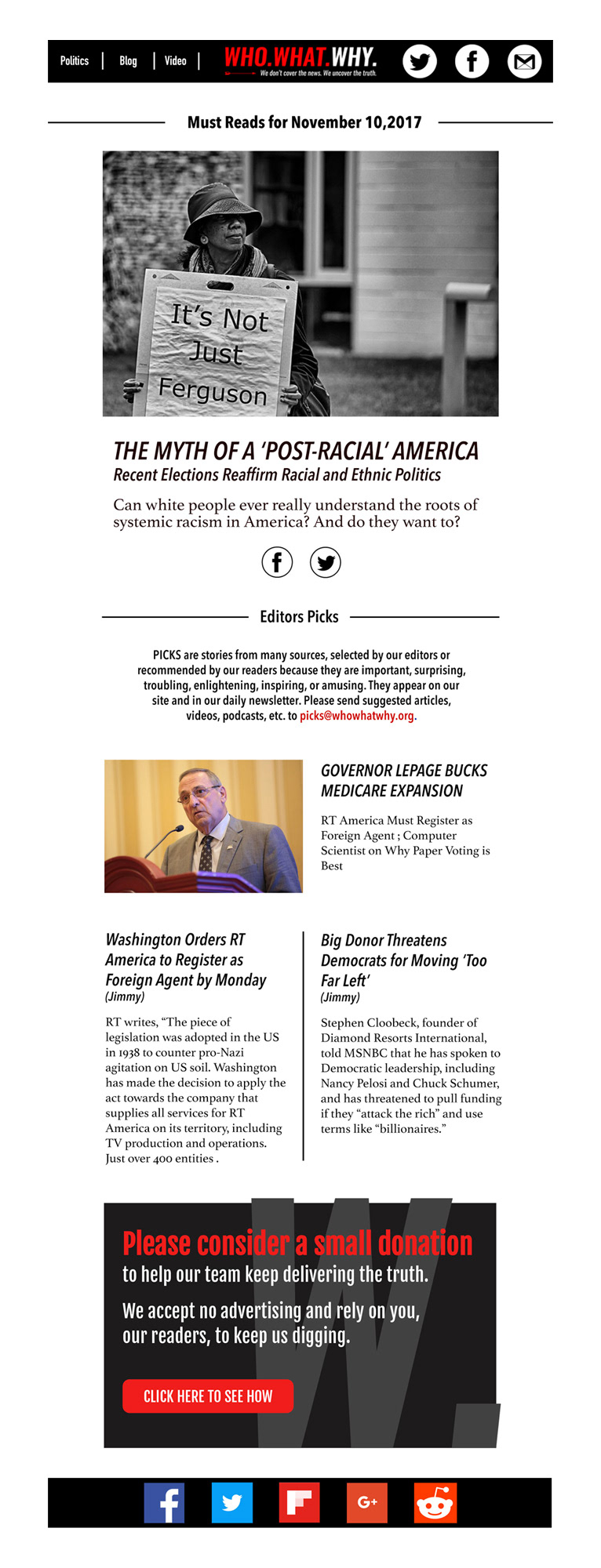
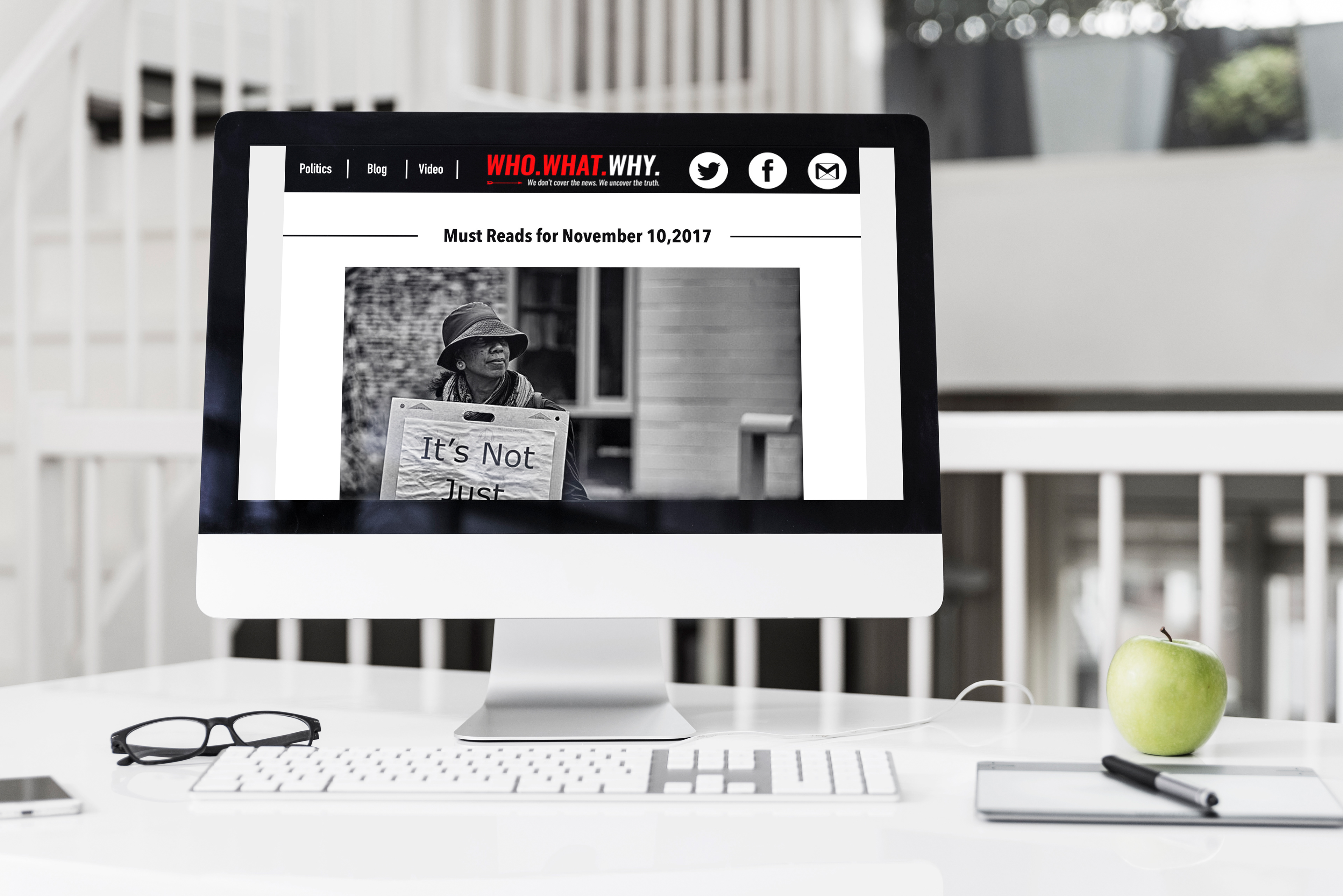
Designed with usability in mind, the final design achieved clear navigation for the reader. Placing the main links along the header in high contrast color and in a larger size allows the links to stand out at first glance. I also placed social media links immediately following the article to encourage sharing. The large, clean links help guide users to the correct places to click beyond the newsletter.
Workflow
Analysis > Research > Mock-up > Design > Submit for Approval > Refresh > Live
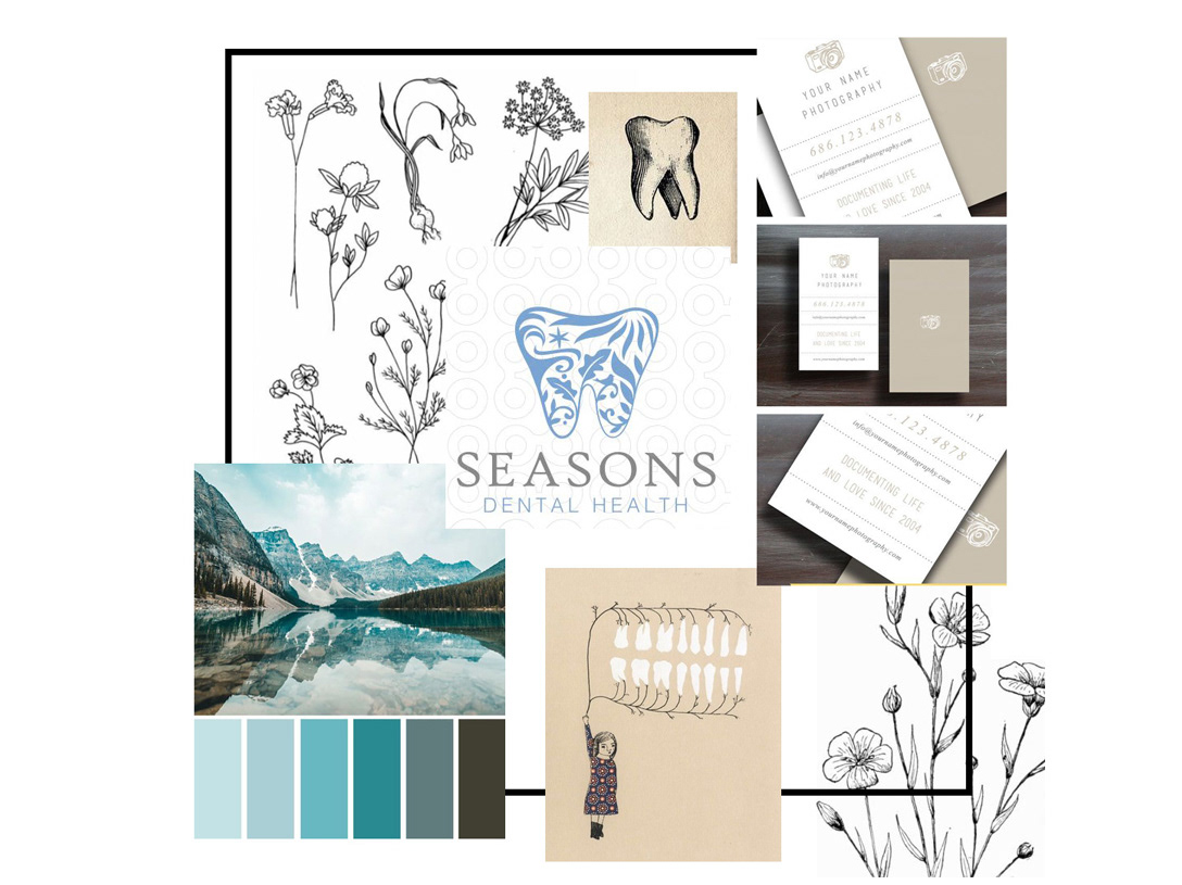
Mood Board
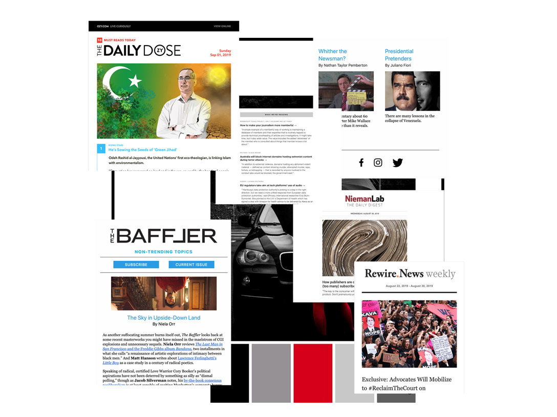
By filling the mood board with inspiring material, I was able to have a clear vision of my goals. These simple, clean designs, with opulent white-space and a color scheme, stay consistent with WhoWhatWhy's established branding.
Wireframe

Final Design
Designed with the usability in mind, the final design achieved clear navigation for the reader by placing the main links along the header in high contrast color and in a larger size to stand out at first glance. I also placed social media links immediately following the article to encourage sharing. Placing large, clean links helps guide users to the correct places to click beyond the newsletter.